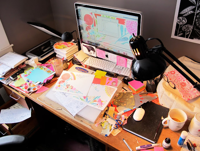
a sneak peek ... a tiny corner of my current custom banner illustration project -sigh
There is no challenge more challenging
than the challenge to improve yourself.
Michael F. Staley
I hope to finish it today - the big deal, anxiety producing collage/painting, hold-my-breath project. It's a 3 part illustration - created extra big to allow me room for lots of detail. It will be scanned in 3 pieces and digitally assembled. So ... why all the holding of my breath ? Well ... when I finished the line drawing for this project awhile back (which does also include a large & prominent hand drawn/typography section) I felt instantly a bit swoony at it's potential - I felt in my creative heart that if done right this piece could/would be a much coveted & beautiful new big feather in my portfolio cap ... a shiny jewel in that darn CE* crown.Plus it's for someone else - that always ups the angst quotient - wanting with all my heart & soul to have her squeal with delight at it's completion, maybe a little jumping up & down while clapping enthusiastically ;-) I know I set that bar pretty darn high - too high often but I know that this high bar of mine is what pushes me forward, always & makes me better & better + I really do love the challenge of pushing myself.
Les messy desk mid afternoon yesterday (below) - Mr. Mr. Oliver gets extremely pissed when my desk gets this full & cluttered 'cause there's no place for him to sit. I do try to keep my printer covered and free of debris & oh thanks so much (not) for the heated pillow topped, maybe catnip scented printer cover. He's already sourcing materials & calculating the cost per unit figure - he's sure North American (+ England of course) sales will be Rockin', he's an entrepreneur cat.
And speaking of cats - pop over to Dani's blog and say hello to her sweet new brood of puppies.
*CE - creative empire

That is quite beautiful.
ReplyDeleteits really good, susan. congratulations! I bet I hear her squeal all the way down heah in jawja.
ReplyDeleteMy recent illustration for a catalog cover was rejected for being "too weird". I still got paid, but it made me insecure for continuing on with them - the chicks that hired me reassured me that "they" liked it but thought the target audience would wig.
such is life.
Beautiful work. The sneak preview has whetted my appetite for more.
ReplyDeleteOh great... you sent me over to a web site with ooodles of poodle puppies ... soooo sweet.
ReplyDeleteLuckily they're in Florida ...
I love all your art Susan !
Love your happy, colorful work space :)
ReplyDelete